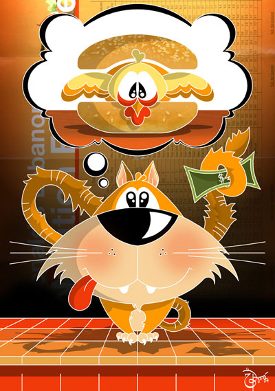
After all I got some free time to color this illustration, it was a little bit difficult to go beyond my comfort zone with those colors, absolutely not my favorites but I was trying to use only the ones in the background page. Although I had my doubts about posting this, here it comes! Constructive criticism and comparison is highly appreciated!
Una hamburguesa de pollo solo por favor!
This week’s theme is plain…so it had to be a plain chicken burger…I don’t know why, but I had no doubts about it! - I would really like to go out of my comfort zone with this one and give it some colors, hope I get some time to do it /El tema de la semana es “plain”…y tenía que ser una simple hamburguesa de pollo!...no sé porque, pero no tenía ni la más mínima duda! – me gustaría poder hacer esta misma ilustración en colores, a ver si tengo un chancecito!


31 comments:
Great illustration. I love the expressions and that it is black and white.
Lovely, great work, really nice illustration!
www.ruisousaartworks.blogspot.com
siiii dale zari siempre es un desafio, te quedara genial ya que a todo lo que le pusiste color te ha quedado muyy bienn.
abrazo ro
haha--nice take on the theme!
cute cat!
Is this adorable or what! Totally cute! Great Job!
fancy cat! nice style..hehe but I feel bad for the pollo!
That kitty is so cool. Love it. The chicken doesn't look to happy about being a sandwich in a thought bubble, hee hee.
Nice work!
Oh! Poor chicken. And cute kitty. May I have a share?
P/S: Thanks for your sweet comment, it make my day too.
Cute one Zari!
Chicken burger... feathers and all! He looks a little upset! Cute illustration Zari!
Qué buenas tus últimas ilustraciones! Sí, en color va a quedar estupenda! Ojalá puedas hacerte un ratito y pintarla.
Besotes!
You come up with some fun illustrations, Zari! The look of antecipation on the kitty's face is great. Great concept and work.
Thanks for your message, by the way. It's definitely a topic close to my heart. :-)
Da mucha penita el pajarito pero tiene mucha gracia el gato. En blanco y negro queda muy bien.
estas cada dia mejor Zari!!! muy buena esta illo!! quiero la version en colores ahora :)
Hey Zari! Thanks for the sweet comment! I realy love yours too! Such a great humour in it ;)!
xoxo
This is fabulous! Great choice using the colors in the background. A limited palette with complimentary colors. Very striking. I'm so impressed! :)
I like it a lot! I think the energetic colors go well with the energy of the shapes. Very dynamic and powerful.
WOW! What a difference! Nice work!!
hey zari, I think its wonderful for you to be exploring colors beyond your comfort zone, I think it turned out great. Of course I love the chicken in between the bun, its hilarious!
me encanto Zari!! quizas no te sientas comoda con los colores pero a mi me gusto esa paleta de colores calidos. Muy bueno!!!! :)
Besote y buen fin de semana!!
(me rei mucho cuando vi que me tocaba ser tu Papa Noel!!, otra larga espera...)
Pues te quedó maravillosa en colores!!!! líndisima..., hasta se antoja comerla y eso q no como carne jajajaja..., q bueno q te animaste a ponerle color..!, q tengas un lindo fin de semana!
Zari, es muy linda la versión technicolor! Por qué no te gusta?
Sea en color o con tus clásica paleta sigue siendo el estilo de Zari, bien definido, contundente y sigue dibujando sonrisas en los que observamos admirados tus diseños.
Congrats for stepping out of your comfort zone! I definitely think you should work in color more often. What I like to do is use colder colors for the background and warmer colors for the foreground/ characters. For me it's easier this way to choose the colors.
Great and amazing theme interpretation! The cat and the chicken have a really nice expression! I like the both versions. :)
Zari, WOW! I already really liked your black and white illo -- shapes and style looked slightly different from what you've usually done. Then you hit us with the colored version! Incredible! I liked that you used the colors from the background pic to bring it all together. Overall, just plain awesome!!! =)
On the contrary, I think you did a good choice on the colors, the illustration is simply great!
I think you did am amazing job with both of these! The black & white, and the colored illustration look amazing!
You really would never know that colored illos are out of your comfort zone. The colors are pretty and vibrant without being distracting. Wonderful job once again!
You didn't just add the color. You turned the background images too. They are clear in the black and white version and contribute to the overall theme/message. It's harder to make them out the the color version, although the color does scream fast food. Really cute.
They both look great and very different. I am partial to the colors though. Great job on both of them.
thank you so much everyone! I'm glad you liked the colored version...i'll try to work more with colors ;)
if i had to do this illo again i'll keep the cat in b&w and the thought in color...but sure I'm not doing it again..haha ;)
hugssssss!!!
quedo impresionante Zari te felicito me gusta muchoooo mas a color.
besos Ro
Post a Comment